MKWY
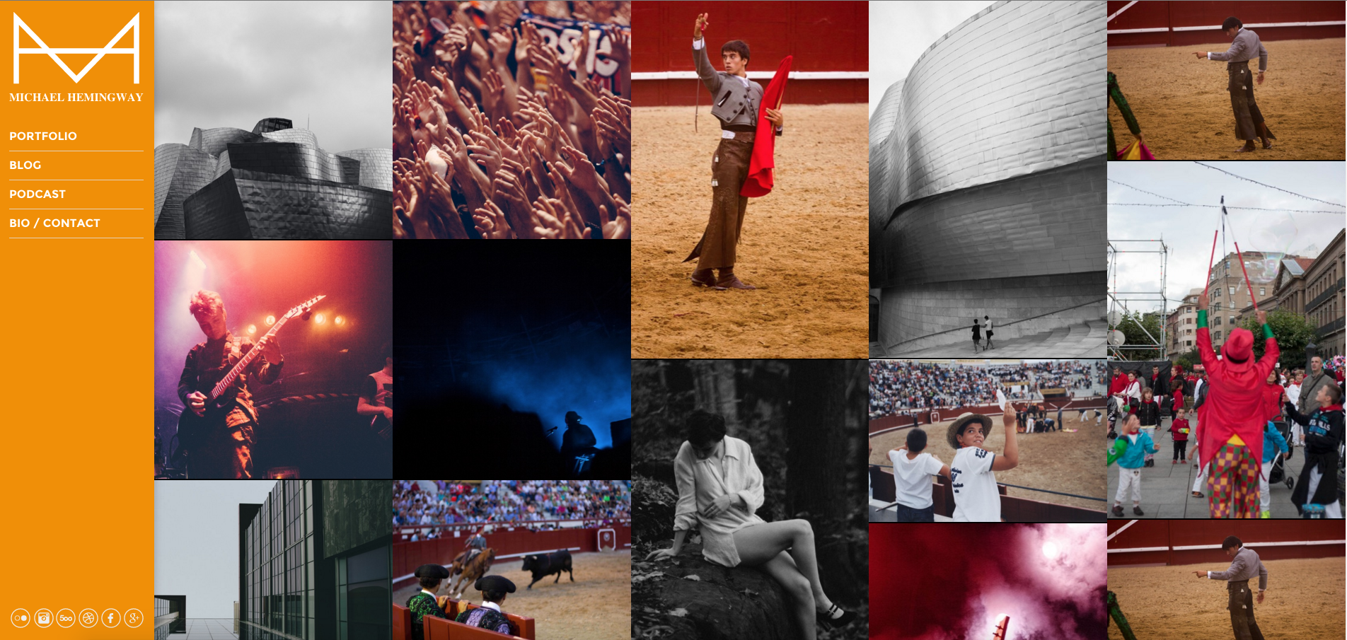
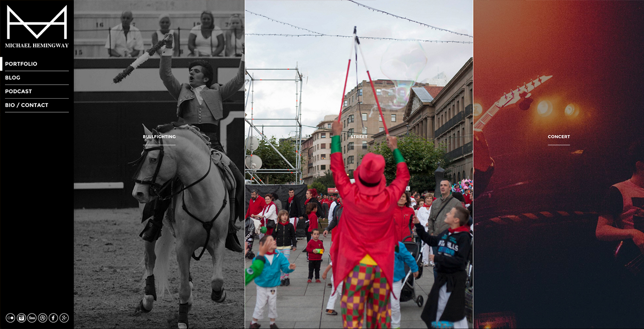
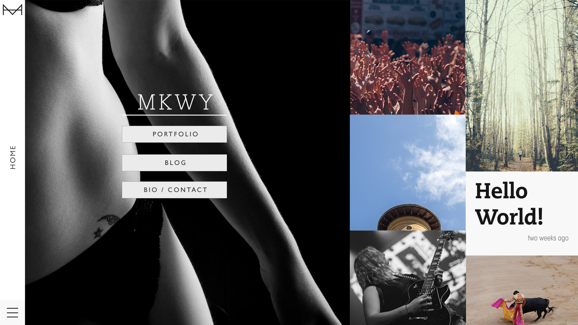
Ah, the oldest still-active project under my belt. Mikemingway, a portmanteau of Mike and Hemingway was my first sortie in web design, branding myself, marketing, organized photographic collections, and in figuring out who I am.

As noted, I learned web design on this site. While this project is categorized as such because it was initially my exercise in web design, this could also safely fall into visual style crafing, SEO, and of course, photography.

The logo on the top left of this site has actually remained largely the same since the very very inception of the brand. While I never watermarked my images; all my handmade buisness cards, web presence and the like had this little superimposed 'M & H' design.

Looking back, it was rather cute. I write the whole thing in Brackets, and all my CSS was plain ol' cascading style sheets - and all in one long file, too. I had at least lerned of minification.
I owe so much of my drive to build to a podcast I was listening to at the time, "Seanwes." Nigh-daily (and eventually weekly as I cought up with the backlog), hour-long shows about productivity and defining one's buisness.


By 2016 I had decided on transitioning into a CMS as detailed in this old post of mine. With that project I taught myself better WordPress, after dipping my toes with the the plant.

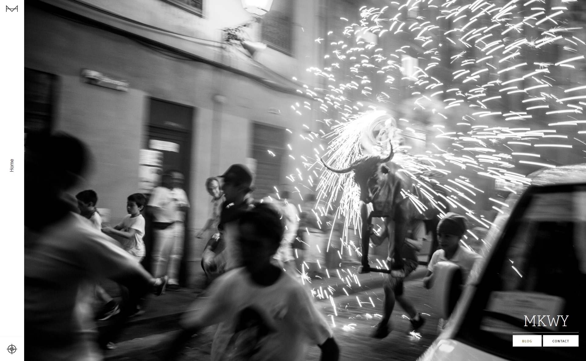
A copy of the original site, and a more up-to-date one at that, lives here on a subdomain. I invite you to discover it for yourselves.